 vue-swipe-modal
Properties
modelValue (v-model) *
Controls the opening and closing of the modal.
| name | |
|---|---|
| attribute | v-model, v-model:modelValue |
| type | boolean (require) |
| default | undefined |
<template>
  <SwipeModal
    v-model="/* boolean */"
  >
    modal content
  </SwipeModal>
</template><template>
<SwipeModal
v-model="/* boolean */"
>
modal content
</SwipeModal>
</template>isBackdrop
Flag whether modal backdrops should be displayed or not.
| name | |
|---|---|
| attribute | is-backdrop |
| type | boolean | undefined |
| default | true |
<template>
  <SwipeModal
    v-model="isOpen"
    :is-backdrop="/* boolean */"
  >
    modal content
  </SwipeModal>
</template><template>
<SwipeModal
v-model="isOpen"
:is-backdrop="/* boolean */"
>
modal content
</SwipeModal>
</template>isDragHandle
A flag to indicate whether or not the "DragHandle" should be displayed at the top of the modal to indicate that it can be swiped to close.
| name | |
|---|---|
| attribute | is-drag-handle |
| type | boolean | undefined |
| default | true |
<template>
  <SwipeModal
    v-model="isOpen"
    :is-drag-handle="/* boolean */"
  >
    modal content
  </SwipeModal>
</template><template>
<SwipeModal
v-model="isOpen"
:is-drag-handle="/* boolean */"
>
modal content
</SwipeModal>
</template>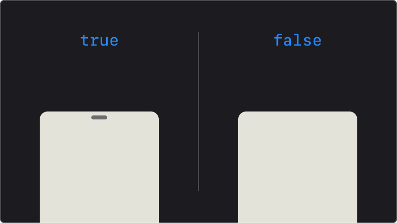
isFullScreen
Flag to indicate whether the modal should be displayed in full screen or not.
| name | |
|---|---|
| attribute | is-full-screen |
| type | boolean | undefined |
| default | true |
<template>
  <SwipeModal
    v-model="isOpen"
    :is-full-screen="/* boolean */"
  >
    modal content
  </SwipeModal>
</template><template>
<SwipeModal
v-model="isOpen"
:is-full-screen="/* boolean */"
>
modal content
</SwipeModal>
</template>isPersistent
Specifying this prop disables the swipe-to-close action (i.e., swiping returns to the start of the swipe without closing). Clicking on the backdrop no longer closes the modal.
| name | |
|---|---|
| attribute | is-persistent |
| type | boolean | undefined |
| default | false |
<template>
  <SwipeModal
    v-model="isOpen"
    :is-persistent="/* boolean */"
  >
    modal content
  </SwipeModal>
</template><template>
<SwipeModal
v-model="isOpen"
:is-persistent="/* boolean */"
>
modal content
</SwipeModal>
</template>isScrollLock
Flag to indicate whether the modal background should not be scrolled (= fixed scroll position) or not.
| name | |
|---|---|
| attribute | is-scrollLock |
| type | boolean | undefined |
| default | true |
<template>
  <SwipeModal
    v-model="isOpen"
    :is-scrollLock="/* boolean */"
  >
    modal content
  </SwipeModal>
</template><template>
<SwipeModal
v-model="isOpen"
:is-scrollLock="/* boolean */"
>
modal content
</SwipeModal>
</template>snapPoint
Modal upper edge position. Specifies how far up on the screen the modal will open (= modal height).
| name | |
|---|---|
| attribute | snap-point |
| type | "auto" | String |
| default | undefined |
<template>
  <SwipeModal
    v-model="isOpen"
    :snap-point="/* auto or String */"
  >
    modal content
  </SwipeModal>
</template><template>
<SwipeModal
v-model="isOpen"
:snap-point="/* auto or String */"
>
modal content
</SwipeModal>
</template>undefinedOpen the modal in full screen (
100dvh)."auto"If "auto" is specified, the height of the element in the modal (the element written in
<SwipeModal>) is automatically obtained and the modal is opened to that height.If the element is larger than the screen, the modal will be displayed in full screen.
Click me to view the code
vue<template> <SwipeModal v-model="isOpen" snap-point="auto" > <div class="modal-content"> <button @click="isOpen = false">close modal</button> <h3>Red line is this element's area.</h3> height is auto. </div> </SwipeModal> </template><template> <SwipeModal v-model="isOpen" snap-point="auto" > <div class="modal-content"> <button @click="isOpen = false">close modal</button> <h3>Red line is this element's area.</h3> height is auto. </div> </SwipeModal> </template>other (
String)You can specify the same value as the CSS <length> data type
Examples :
100px,50dvh,10em.Click me to view the code
vue<template> <SwipeModal v-model="isOpen" snap-point="50dvh" > <div class="modal-content"> <button @click="isOpen = false">close modal</button> <h3>Red line is this element's area.</h3> height is auto. </div> </SwipeModal> </template><template> <SwipeModal v-model="isOpen" snap-point="50dvh" > <div class="modal-content"> <button @click="isOpen = false">close modal</button> <h3>Red line is this element's area.</h3> height is auto. </div> </SwipeModal> </template>
.d.ts
type PropsType = {
 /**
   * Whether to display the backdrop.
   *
   * @default true
   */
  isBackdrop?: boolean
  /**
   * Whether to display the drag handle.
   *
   * @default true
   */
  isDragHandle?: boolean
  /**
   * Whether to display the modal in full screen.
   *
   * @default true
   */
  isFullScreen?: boolean
  /**
   * Whether to disable swipe and back drop click events.
   *
   * @default false
   */
  isPersistent?: boolean
  /**
   * Whether to disable scroll of the background.
   *
   *  @default true
   */
  isScrollLock?: boolean
  /**
   * Whether to display the modal.  = `v-model`
   *
   * @default false
   */
  modelValue?: boolean
  /**
   * Modal upper edge position.
   *
   * - `auto`: Automatically calculates the display position based on the height of the content in the modal.
   * - `String` : [\<length>](https://developer.mozilla.org/ja/docs/Web/CSS/length) data type
   *
   * @default undefined
   */
  // eslint-disable-next-line @typescript-eslint/ban-types
  snapPoint?: "auto" | String
}
type PropsType = {
/**
* Whether to display the backdrop.
*
* @default true
*/
isBackdrop?: boolean
/**
* Whether to display the drag handle.
*
* @default true
*/
isDragHandle?: boolean
/**
* Whether to display the modal in full screen.
*
* @default true
*/
isFullScreen?: boolean
/**
* Whether to disable swipe and back drop click events.
*
* @default false
*/
isPersistent?: boolean
/**
* Whether to disable scroll of the background.
*
* @default true
*/
isScrollLock?: boolean
/**
* Whether to display the modal. = `v-model`
*
* @default false
*/
modelValue?: boolean
/**
* Modal upper edge position.
*
* - `auto`: Automatically calculates the display position based on the height of the content in the modal.
* - `String` : [\<length>](https://developer.mozilla.org/ja/docs/Web/CSS/length) data type
*
* @default undefined
*/
// eslint-disable-next-line @typescript-eslint/ban-types
snapPoint?: "auto" | String
}